Springdale Graphic Designer Katie Hughes discusses the musical inspiration behind Back Pocket Beer, the third beer to drop in our 2020 Hazy IPA series.
One of my favorite things about graphic design is that it is not only visual, but there is so much room for inspiration from all of your other senses. It’s easy to let your sense of sight carry you through design, but amazing things happen when you pay closer attention to the smaller details, and they make for a more interesting visual outcome.
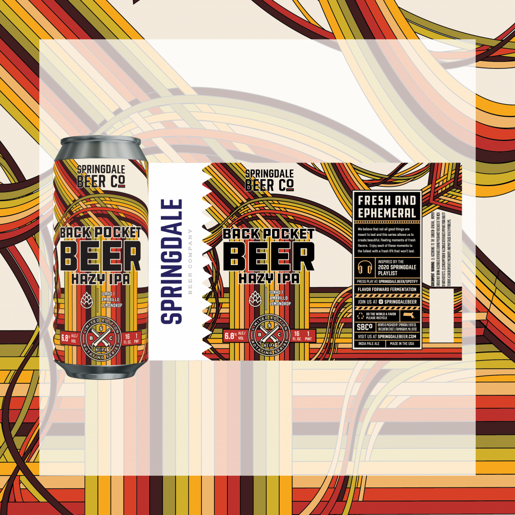
Back Pocket Beer was my first shot at designing a label in this series based on our Springdale 2020 Playlist. This hazy IPA featuring a jammin’ mix of Idaho 7, Amarillo, and Lemondrop hops. The name of the beer was chosen based on the song “Back Pocket” by Vulfpeck, a super funky mix of old school groove and modern pop. After listening to the song at least 100 times (not an exaggeration) and letting my sense of sound direct my visual sense, the idea for the label quickly came together.
Firstly, there was the overall FUNK! I felt like I was thrown back into the ‘70s with bell-bottom jeans, disco balls, and psychedelic interludes. The song feels very rigid with its staccato verses, yet the chorus and bridge are smooth and silky. The Vulfpeck song also has a multi-part harmony that carries throughout the song — sometimes coming together into one voice — then bifurcating into a net of complementary notes.
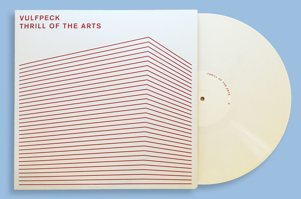
Then there is the visual aspect to the song and what pops into my head when I hear “Back Pocket.” That visualization hit me after putting on my research cap and doing some digging. A crucial part of design is DOING RESEARCH! Generally, artists had a reason to design the way they did, so using their work as inspiration, even if it is as simple as using the same color with a completely different design, is a great place to start. So I looked at the album cover for the song. What made the band choose this artwork? The song is so funky, what made them want to use rigid straight lines in such a minimalistic way?
Combining the notes I had taken from the sound of the song with the research conducted looking at the band’s various album covers, I came up with what is now Back Pocket Beer. The colors were inspired by a funkier time, and I wanted to keep the line structure but in a less rigid format so the design was more playful. I imagined each line being one of the voices in the song, coming together and straying off in a free-flowing wave. After creating this, I realized that the overlapping lines looked like strands of thread that worked together perfectly with the concept of a pocket. The final design resulted in a label that merged the name “Back Pocket Beer,” the sound of the song, and the visual familiarity of that era of music.
Sit back, throw on some tunes, and enjoy our new Back Pocket Beer.